本文来自阅读极客时间专栏《左耳听风》89 程序员练级攻略:UI/UX设计 文章中的推荐阅读
** 原文链接:https://uxplanet.org/the-psychology-principles-every-ui-ux-designer-needs-to-know-24116fd65778 **

Psychology plays a big part in a user’s experience with an application. By understanding how our designs are perceived, we can make adjustments so that the apps we create are more effective in achieving the goals of the user. 心理学在用户的应用体验中起着重要作用。通过了解我们的设计是如何被感知的,我们可以进行调整,以便我们创建的应用程序在实现用户目标方面更有效。
To help you understand the perception of the user, I will introduce some design principles which I think are the most important, and also provide common examples of these principles in practice. Let’s start with the Von Restorff effect: 帮助你理解用户的感受,我将介绍一些我认为最重要的设计原则,并在实践中提供这些原则的常见例子。让我们从冯·雷斯托夫效应(Von Restorff effect)开始:
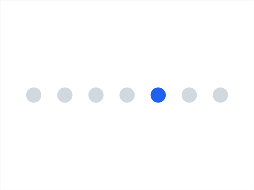
The Von Restorff effect (also known as the isolation effect) predicts that when multiple similar objects are present, the one that differs from the rest is most likely to be remembered! Von Restorff效应(也称为隔离效应)预测,当存在多个类似对象时,最有可能记住与其他对象不同的对象!
Does this ring any bells? 这个预测准确吗?
This is the main reason why all call-to-actions (CTAs) look different from the rest of the action buttons on a site or application! 这就是为什么所有动作调用(CTAs)看起来都不同于网站上或应用程序上的其他动作按钮的主要原因!

We want users to be able to differentiate between a simple action button and a CTA, in order for them to have a clear understanding what the CTA does, whilst also remembering it throughout their use of the application or site. 我们希望用户能够区分简单的操作按钮和CTA,以便他们清楚地了解CTA的作用,同时在使用应用程序或网站的过程中记住它。
“When multiple similar objects are present, the one that differs from the rest is most likely to be remembered!” 当存在多个相似的物体时,最有可能记住与其他物体不同的物体!
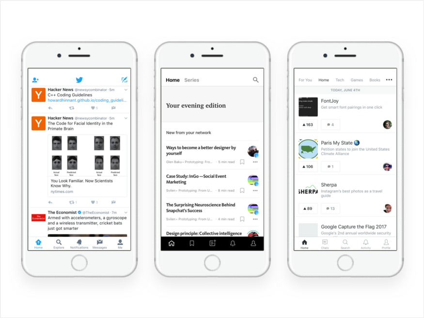
The Serial Position Effect is the propensity of a user to best remember the first and last items in a series. 序列位置效应是用户倾向于最好地记住序列中第一项和最后一项。

This is why most applications nowadays ditch the hamburger menu and go for a bottom or top bar navigation, placing the most important user actions to the right or left. In the image above, you can see some examples from popular iOS applications. Each put the “Home” and “Profile” items all the way to the left and right, with serial position effect in mind. 这就是为什么现在大多数应用程序放弃汉堡包菜单,选择底部或顶部的导航条,将最重要的用户操作放在右侧或左侧。在上图中,您可以看到一些流行的iOS应用程序的示例。每个都将“主页”和“配置文件”项目一直放在左右两侧,并考虑到序列位置效应。
Cognitive load refers to the total amount of mental effort being used in a person’s working memory. To put it simply, it is the amount of thought you need to exercise in order to complete a specific task. 认知负荷是指在一个人的工作记忆中所使用的脑力的总量。简单地说,它是完成一项特定任务所需要的思考量。
“Cognitive load is the amount of thought you need to exercise in order to complete a specific task.” 认知负荷是为了完成一项特定的任务而需要锻炼的思想量。
Cognitive load theory can be differentiated into three types: 认知负荷理论可分为三种类型:
1.Intrinsic cognitive load 1.内在认知负荷
2.Extraneous cognitive load 2.外来认知负荷
3.Germane cognitive load 3.相关认知负荷
I will touch upon the Intrinsic and Germane types as I think that these are the most applicable to UX design. 我将讨论内在的和相关联系的类型,因为我认为它们最适用于UX设计。
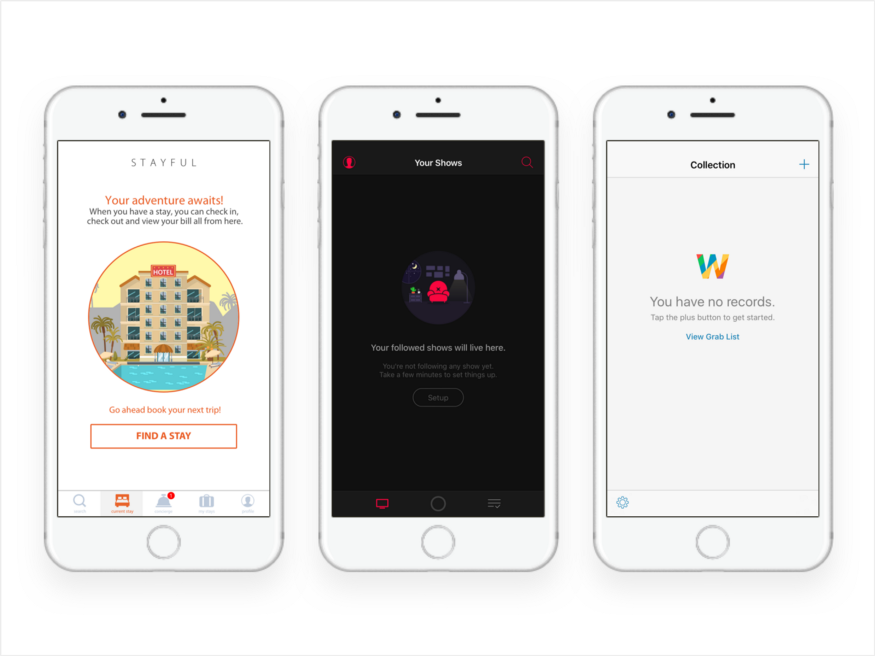
Intrinsic cognitive load is the difficulty associated with a specific instructional topic. It’s the main reason micro-copy and copy play a huge role in a good user experience. 内在认知负荷是与特定教学主题相关的困难。这是微拷贝和拷贝在良好的用户体验中发挥巨大作用的主要原因。
For example most of the time on applications’ empty states, we prompt users to complete a task. Here, the copy needs to be short, simple and with the appropriate words in order for the user to be able to easily follow the instructions. 例如,大多数情况下,在应用程序的空状态下,我们会提示用户完成一项任务。在这里,副本需要简短、简单和适当的文字,以便用户能够轻松地按照说明进行操作。

Germane cognitive load is the cognitive load devoted to processing information and construction of schemas. The schemas describe a pattern of thought that organises categories of information and any relationships among them. 相关认知负荷是专门用于信息处理和模式构建的认知负载。这些图式描述了一种思维模式,它组织信息的类别和它们之间的任何关系。
One of the reasons we use design patterns is because they’re something we’re programmed to do by default — so it’s easier for the users to recognise and learn something new if they can discern it into a pattern from something they already understand. 我们使用设计模式的其中一个原因是,它们是我们在默认情况下编程要做的事情——因此,如果用户能够从他们已经理解的东西中将其识别为模式,那么他们就更容易识别和学习新的东西。
“It’s easier for users to learn something new if they can discern it to a pattern from something they understand” “如果用户能够从他们所理解的事物中辨别出某种模式,那么他们更容易学习新事物。”
Hick’s Law is the most popular principle, along with the Gestalt Laws. 希克定律是除了格式塔定律之外最流行的原理。
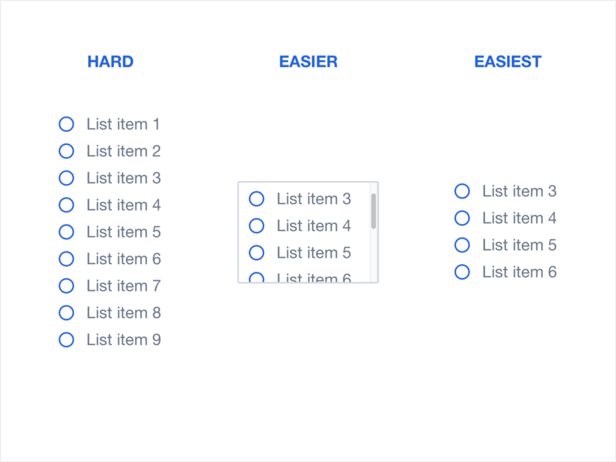
It’s also very simple to understand and practice. Hick’s Law describes that the time it takes for a person to make a decision depends on the choices available to him or her. So if the number of choices increases, the time to make a decision increases logarithmically. 它也很容易理解和实践。希克定律描述了一个人做出决定所需的时间取决于他或她所能做出的选择。因此,如果选择的数量增加,做出决定的时间将以对数方式增加。
A very nice example of Hick’s Law that applies to user experience design are lists: 适用于用户体验设计的希克定律的一个很好的例子是列表:

Law of proximity is part of the Gestalt Laws of Perceptual Organization, and it states that objects that are near, or proximate to each other, tend to be grouped together. To put it in simpler terms, our brain can easily associate objects close to each other, better than it does objects that are spaced far apart. This clustering occurs because humans have a natural tendency to organise and group things together. 邻近法则是知觉组织的格式塔法则的一部分,它指出,接近或接近彼此的物体倾向于组合在一起。简单地说,我们的大脑可以很容易地将彼此靠近的物体联系在一起,这比那些相隔很远的物体要好。这种聚集的发生是因为人类有一种自然的倾向,将事物组织在一起。

“The Law of Proximity states that objects that are near, or proximate to each other, tend to be grouped together” 邻近定律规定,彼此接近或接近的物体倾向于组合在一起。
In the example above, there are 72 circles. We recognise the circles in groups, based on the distance between them. Categorically, we also perceive that there’s a group of 36 circles on the left side of the image, and 3 groups of 12 circles on the right side of the image. 在上面的例子中,有72个圆。我们根据两个圆之间的距离,对它们进行分组识别。明确地说,我们还发现图像左侧有一组36个圆圈,右侧有3组12个圆圈。
I believe this example makes it clear that there is a need to group things together when designing a UI, as well as the importance of being careful when putting things together since users may naturally think they are associated with each other. 我相信这个例子清楚地表明,在设计一个UI时需要将事物分组在一起,并且在将事物组合在一起时要小心,因为用户可能会自然地认为它们是相互关联的。
Originally published at blog.marvelapp.com on June 8, 2017. 最初于2017年6月8日在blog.marvelapp.com上发布。